Greenlit Pete
+44 (0) 7900 220 313        [email protected]
  • Home
  • Spots & Vignettes
  • Line Work
  • Silly Bird Series (Watercolour)
  • About
    • Shop
  • Shop
  • Contact

Derwent Graphite Pencils

12/13/2016

1 Comment

 
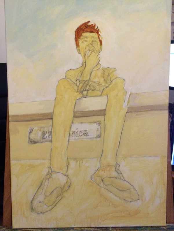
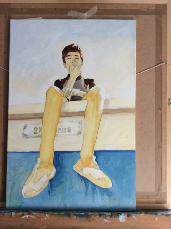
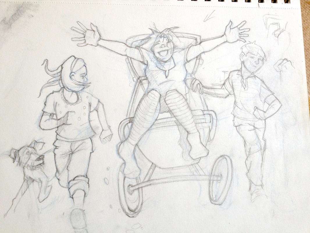
I've recently been fortunate enough to have been sent a set of the newly improved Derwent Graphic set to try out. I have to say that my pencil work has usually been reasonably quick sketches as a means to get on to other medium. The darker I need the mark to be the more pressure I apply! I appreciate this isn't the best appraoch but drawing has been a means to an end to a degree,

However, with these new graphite pencils I knew from the off that I should treat them with a degree of respect and perhaps I could try and use them properly.
Picture
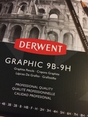
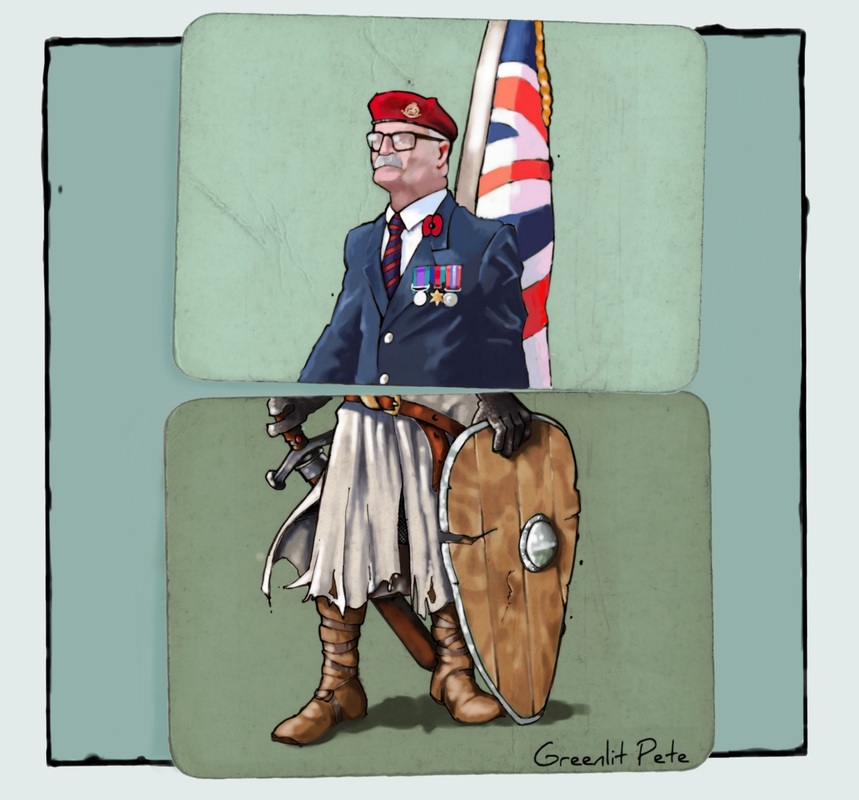
So I took the time to read up on what other artists had created using this set, especially the remarkable work of Alexis Marcou. His work is stunning and so I went through every grade of graphite from the set to try them out. Each one producing a slightly different mark, all with the same amount of pressure. It felt like a completely different method of working then I usually apply. So I found a subject that might be a little challenging and set about giving them a proper test drive/draw!

Picture
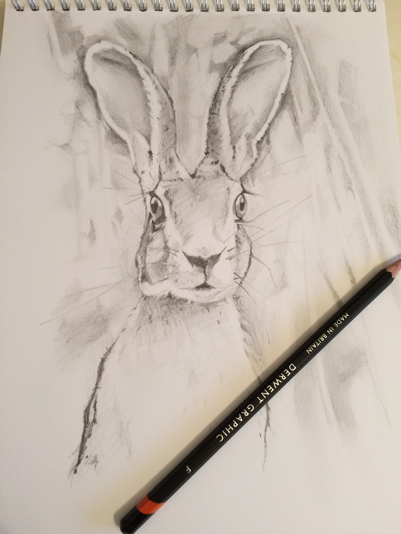
This took a few hours but it's my first attempt to really try and do these graphite pencils justice. I'm pleased with the outcome and have been hugely inspired by the quality of work that some artists have achieved with this set. More details can be found on the Derwent blog here. http://www.lovepencils.co.uk

Now this test sketch is done I'll get going with a more detailed drawing and see what can be achieved. I intend to chart my progress and report back as soon as I can. I'm really looking forward to seeing what I can achieve next.

1 Comment

Anger Management

10/12/2016

2 Comments

 
I suppose there is a degree of irony of an illustrator having to think about the idea of anger management. I like to think I have some pretty good ideas when it comes to illustrating and being able to consider a client brief.
Picture
The problem is that these ideas are great all the while they stay in my head. Getting them down on paper, that's a different matter. So, with this illustration it helped a little that it took a while for the sketch to evolve. I knew that the concept would be an illustration of a character going from angry to calm with a visual colour coded 'monitor'. Once I'd established the style of the character I sketched out a couple of versions on paper first. I was happy with the idea of a red cloud descending over the angry character as well as the calm pose of the other character.

One of the best bits of advise I was ever given (and happy to pass it on) is if you intend to create a digital illustration then do as much work up front using pencil and paper as you can. Keep working until you have an idea you're happy with. I'm now at the stage where I'm happy with the concept, characters and layout. Now I need to produce a finished sketch. I map this out on a sketch pad first in pencil and then ink it up using a mix of Staedtler or Pigma Micron liners. I want the finished illustration to look real, like it's a sketch, warts and all so any slight imperfections are fine. This 'real' look includes the paper and so once it's finished I take a photo of the finished sketch and put it on my desktop.
Picture
My favourite application of choice is Autodesk Sketchbook Pro. I've tried others and they're either too big for what I need or aren't intuitive enough. I need to feel as if I'm actually drawing at all times. I open up a new file working at around 2,000 x 1,500 pixels and import the sketch. Whether digital illustration or animation the key to working to deadlines is to keep everything tidy. If you have multiple assets for a project then keep them all together in one folder. Save regularly and embrace 'cmd + S' as a muscle memory. Sketchbook has a comprehensive undo facility but getting into the habit of saving your progress at very regular intervals is certainly one way to remain calm.

You'll see from the above that my Sketchbook layout is fairly sparse. The lagoon is of no real use at this point and is neatly out of the way. The toolbar across the top is of regular use although I have got into the habit of using keyboard shortcuts. On the far left of the screen I have the simplest of brush palettes. As I've completed most of my inking on the sketch itself I don't need to do much of this 'in machine'. For every new project you can also create a separate colour palette. It's really useful that with Sketchbook there is a huge degree of flexibility of how this is done and maybe it will be worth exploring in more depth at some point.

Picture
In order to be able to paint behind the sketch and still see the pen lines I set the sketch layer to 'Multiply'. I also need a little bit more paper texture so I photograph another piece of old and stained paper and import this into Sketchbook also setting this layer to 'Multiply'. This means that when I include a green colour background on a separate layer beneath the sketch and paper texture I can still see both over the colour.

Picture
The rest of the sketch is then painted digitally using a Wacom Intuos (Medium) pen and tablet. I use a basic paintbrush tool and use keyboard shortcuts to vary the size and opacity of the brush as I go. I tend to paint all new elements onto a new layer until I'm happy with them and then merge with lower layers as I go.
Everyone is different but the key for me is to keep the entire process as close as possible to simply drawing on a piece of paper.


2 Comments

Something new with each painting

3/31/2016

0 Comments

 
I love painting!

That's got to be a similar reason for all of us to paint, create, make, bake, sculpt  .....

A second reason must be that each time we tackle a new project we learn a little bit more, we develop our understanding of what we do. It might be a new technique, a new way of mixing colors, a new way to prepare the materials.  This latest painting of the lovely kids of friends has been one such exercise.

I don't know about other people but I have an equal measure of excitement of starting each new piece and fear that it won't look anything like the image in my mind. With this particular commission all that apprehension was compounded by the fact that I knew the subjects. I knew what they looked like and I knew their characters and as such it was important that I tried to paint the youngsters I knew.

I started by mixing a suitable tone in acrylic and putting down a base coat onto the canvas. once this was ready I sketched out the outline incorporating the main areas of light and shade. I wanted this to look like a painting. Not a photo realistic copy but a painting with blemishes, one that was nearly there but not quite. I was keen for this to convey a sense of pace with areas that had no detail but looked as if it did. I don't mean this to sound like creative mumbo jumbo but I suppose what I wanted was for the painting to reflect that of a couple of young kids. Bags of energy , not fully formed but with lots of potential to grow.

The painting itself was completed using only six oil colors. This is a snapshot of the process from start to finish.
Picture
0 Comments

The problem with personal projects ....

1/14/2016

0 Comments

 
... is that they always have to take a back seat to paid work.

I know that I've said this before but my best work is in my head. The imagined pieces that I carry around in my head before I transfer them where others can see (and judge) them. When that imagined image is ready you can get to work planning in out, getting the material prepared and then get to work. Put down the basics and then work until it's refined and finished. Now, for this to work properly you need to have the time to do all of this in one block of time (or as near as possible). This keeps the idea fresh, keeps you motivated and you can work before that original idea in your head changes or gets too hazy.

Don't get me wrong I'm a huge fan of paid work. They only downside is that those personal projects which you do for love or just the hell of it but never for financial reward slide down the list of priorities. This is exactly what happened with this particular piece. We'd had a great time with friends again last summer in Woolacombe, lots of kids getting together, lots of sunshine on the beach and spending valuable time having fun. The focus of most of the day time activity was around the beach huts. One of my favourite images was of the lad sat on top of the hut eating an apple in between time with his mates in the sea. This was the image I wanted to paint to remind me of the warmth, smells and fun of last summer.

Picture
These are a selection of images showing the various stages this painting has taken during three months to get round to finishing. Now all I have to do is finish those other five canvases!
Picture
Picture
Picture
Picture
0 Comments

Quick sketch

1/14/2016

0 Comments

 
I know this is gonna sound really bizarre but my study enjoys a lovely window with a ledge for the pooch to laze and snore in the sunshine. I had a spare half hour waiting for a telephone call today so decide to grab a sheet of colored paper and practice. I've always try and make a bit of time every day for a practice. Just as I was about to start the dog leapt up and went bonkers! The target of her anger was the neighbours cat who dared to stalk a squirrel in the street. We both stood and watched as this battle played out, for the sake of this story lets say the squirrel made a getaway!

So my sketch this morning was my feeble tribute to the bushy tailed valiant efforts.
Fur colour has been changed to protect identities.

Picture
0 Comments

The cards are becoming a theme

3/3/2015

0 Comments

 
I started with a few ideas based around the old flip books. This seemed like a good device to mix and match pictures. The latest one came about as an idea when i was watching the remembrance service on TV. So many of the old soldiers seemed to stand in the cold waiting to go on parade with a steely grit. I wondered how many of whom might be there for the last time when it struck me that we owe it to them to not forget. As my Grandad used to say, 'Old soldiers never die but fade away'.


Picture
Picture
0 Comments

What do you get if you cross a panda with a robot?

12/2/2014

0 Comments

 
Picture
.... a Mermaid of course!
I know, not a natural process of development but that's what happened with this latest illustration. The brief was to create a bright and colorful kids illustration visualizing the concept of imagination. Ideas pop up at the oddest time and rarely when I'm sat at my desk with pencil poised. I'm sure this is the same for many of us and that's why I seem to have sketch pads scattered around the house. Hence this quick thumb sketch. The idea was harking back to those flip pads I remember as a kid. As much as I liked the initial idea I wasn't sure if A. Pandas posses an imagination and B. if they did would they use it to imagine themselves as robots!

Picture
OK, so I decided to go with a slightly more conventional approach (assuming mermaids are more conventional!)

This is a snap shot of the work in progress. By this stage the idea was, thankfully fully formed. I'd refined the sketch and inked it up with a fantastic new grey tone Copic liner on extra smooth Bristol Board - what else. (That's the first snap on the top left).

From here I continued with Sketchbook Pro. The important element was to try and stick to my original colour palette and keep the illustrative look. The only deviation I allowed myself was to draw a slightly more realistic finish on the fish tail as well as the ring binders.  Nearly happy.

Picture
I still needed to make sure the flip book 'sat properly', to make sure it looked like it actually existed. So the few final touches included sketching in the flip book back ground, adding some additional pages behind the picture and then some drop shadow to put it in place. After some slight changes to the tone and detail to the tail I added a bit of 'wear and tear' detail to the corners of the page. Now it looks as if the flip book has pages that you could turn it's time to turn them over and see what other combinations we can create! (Well, that's the idea for the next illustration)

0 Comments

A little pre Christmas work in progress

11/27/2014

1 Comment

 
This month has been taken up with paid projects (always a good thing - not moaning). However this has left little time for development work or those cracking little projects that carry no payment but which satisfy the creative heart.
I've submitted a couple of illustrations to a fabulous new magazine and am genuinely chuffed to have been asked to contribute.
Picture
This was my first contribution and illustrates a story suggesting that Cardiff and Bristol should work more collaboratively. Not easy for two regions that are fiercely proud of their independence and achievements.

Picture
December and January's editions haven't been published yet, obviously. However, this is a sneak peak of my contributions to the next two editions.


1 Comment

From initial sketch ......

9/18/2014

0 Comments

 
Picture
All my work is brilliant .... all the while it stays in my head!

It's when I start to put it down on paper that the problems arise. I admire those illustrators that seem to see a perfectly formed idea in their head and then simply make it real. My process is slightly more evolutionary with tweaks and subtle changes happening around the basic concept.

Some ideas stay as initial pencil sketches for a while (dependent on deadlines) and I can work/rework these adding a little more detail at a time.

Picture
Sometimes having sketched out the composition a couple of times to make sure I'm happy with the layout I'll ink out a final version. Colour and tone aren't important at this stage that can wait awhile.

Picture
Once I've scanned the artwork I can start getting to grips with the final version. It's at this stage that I start working in my favourite application, Sketchbook Pro. I don't want to get bogged down with the minutia of the detail at this stage but still work within a pixel dimension around 2,500 x 2,500 and a dpi of 300.

Before starting any project I always find it helps to do at least a fifteen minute 'warm up' sketch.
A bottle of wildflowers sat on my desk did the trick this time.

Back to the project at hand. No need to zoom into the detail yet as my first layer is just roughing out basic colours and tone. Using a wacom tablet and stylus (digital drawing tablet) combined with the drawing and painting tools of Sketchbook means that this process continues to feel like traditional artwork. The only significant difference for me is that I'm drawing on a tablet on my desk and watching the results on my monitor. The hand to eye co-ordination issue takes a while but once you get the hang of it then it becomes almost second nature. Initially working on a Quantel Paintbox back in the late 90's on breakfast TV provided a great and steep learning curve.

Picture
Sketchbook makes it easy to create a specific palette for a project to which you can add as you go. I usually set my scanned sketch to around 40% opacity and as a 'Multiply' layer. That way you can see all the other layers above this guide sketch as you work. I use a single pencil tool set to hardness/size HB/1.5 to sketch out a cleaner line art layer. The drawing tablet means that I can use the pencil in the same way I can a real pencil varying the pressure drawing from faint to hard lines. Once I'm happy with this I can discard my guide layer and start adding the layers of colour. I tend to then just use a single paintbrush set to around 25% opacity changing the size of my brush using keyboard shortcuts. So working either in traditional or digital medium for me it's all about that initial sketch.

0 Comments

If Dragons were real?

7/19/2014

0 Comments

 
Picture
Picture
Two recent "Dragon" related illustrations. One being a Dragonfly the other a Sleeping Dragon. I'm glad only one of them really exists. Sort of .....

0 Comments
<<Previous
Forward>>

    Archives

    July 2020
    June 2020
    February 2020
    January 2019
    July 2018
    October 2017
    February 2017
    January 2017
    December 2016
    October 2016
    March 2016
    January 2016
    March 2015
    December 2014
    November 2014
    September 2014
    July 2014
    April 2014
    March 2014
    February 2014
    January 2014
    November 2013
    October 2013
    September 2013

    Categories

    All
    Anime Studio Pro
    Autodesk
    Bristol
    Dragon
    Genie
    Greenlitpete
    Greenlit Pete
    Illustration
    Oil Painting
    Pete Levy
    Piggles
    Rwa
    Sketch
    Sketchbook Pro
    Speed Painting
    St Mary Redcliffe
    Tutorial
    Viva
    Warm Up

    RSS Feed

Picture
Telephone: 07900 220 313
Email: [email protected]