|
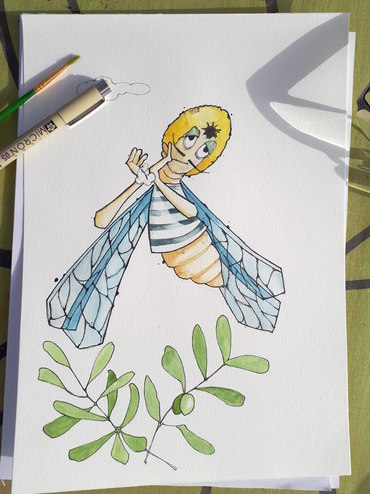
I'd like to share a little speed painting I did this morning using #procreate of an #illustration called 'Not all home schooling is the same'. I hope you enjoy it.
2 Comments
This is a speed painting created using the excellent Procreate. I've taken a quick sketch to complete a finished illustration. Here is a time lapse speed sketch of a reasonably simple sketch I completed recently using the fabulous Procreate 5 on my ipad. This was done during a very long / delayed train journey during Storm Dennis.
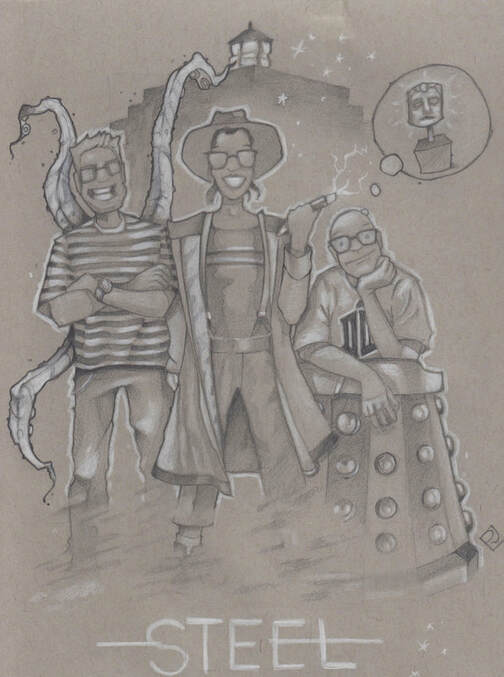
This year, as the VFX Producer working on Series 11 of Doctor Who I had the pleasure of working with two very talented production staff.
I thought it only fitting to say a heart felt 'Thank you' in the only way I knew how and imagine them as characters from our very own Doctor Who adventure. Thank you Paddy and Anne x Last year I had the absolute pleasure of being the VFX Producer on a superb episode of Black Mirror called Metalhead.  I was genuinely intrigued by the fantastic imagination and writing prowess of the shows creator, Charlie Brooker. Here is an interview he gave explaining some of his thought process behind this particular episode. I thought it might be fun to try and illustrate Charlie's thought / writing process in the form of a Heath Robinson illustration.
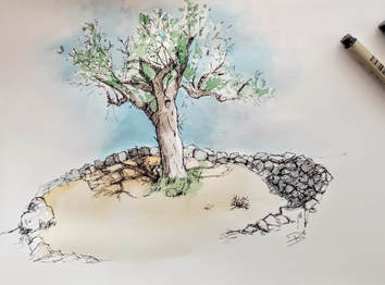
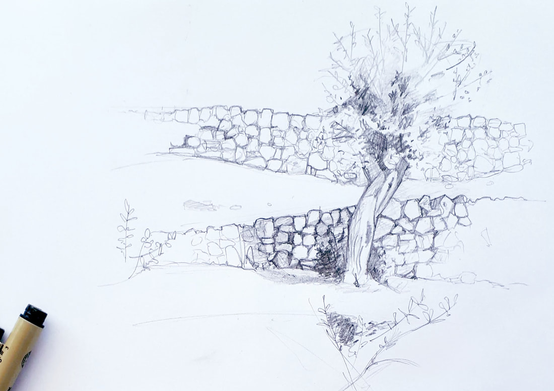
There's nothing like a week away from the office, constant sunshine and stunning views to provide more than enough inspiration to get those pens out and start drawing.
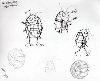
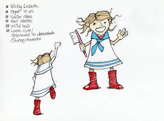
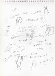
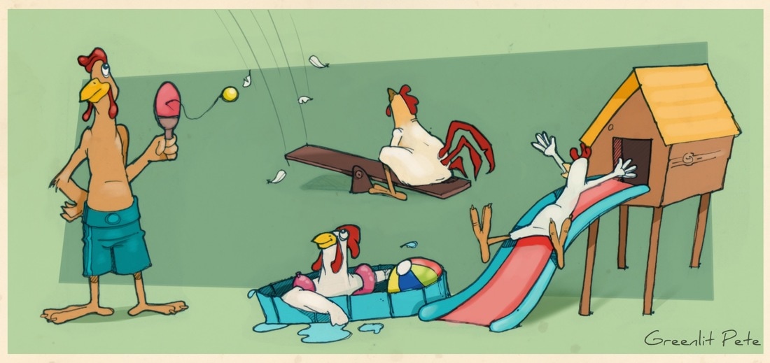
Here are a few of my doodles from our recent visit to the exquisite hills above the beautiful Majorca village of Fornalutx A new cracking exercise working on a book project. 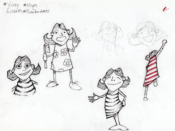 I liked the idea of this story featuring a little girl and her pet woodlouse. The first exercise was to roughly sketch out the two characters. 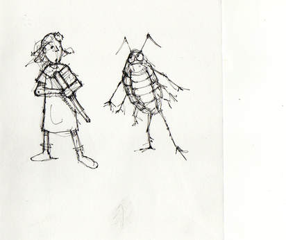 Thankfully I was working to a brief for this project so I was aware of some of the specific details up front. I knew what Vicky was to look like and the audience to whom she was to appeal. I love the idea of taking stories that I enjoyed as a kid and re imagining them in my own style. But to be honest way back when we had some fairly awesome illustrators. Edward Ardizzone being my absolute favourite. By and large I'm relaxed about being self taught but ongoing learning adds to a constant sense of always trying to catch up. I'm keen to learn more from others both creatively and technically. For me the very best way to learn is to watch others work. I'm happy to unpick my own process and throw it into the mix if it helps. If it does nothing but show someone how not to do something then I've helped. Here I'm looking to create a spot and quarter page illustration to accompany a magazine article. The article provides a list of tips and suggestions for activities that will help keep chickens healthy and happy during the colder months.
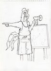
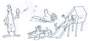
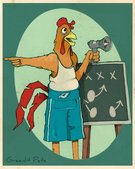
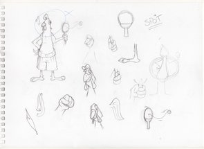 This one was just trying to figure out the character of the ‘coach’ or instructor. I liked this approach with these sketches but he still looked a bit goofy, not a look I wanted. Still, this page gave me the start of the pose and also gave me the idea of the bat and ball as part of the quarter illustration. 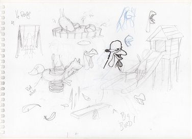 I looked at some fun playground activities which might work with an illustrated chicken. I kept away from trying to illustrate a real chicken and real items as per the article. I thought giving each chicken character and different identities might add to the fun of the piece. This page included the start of a sketch for the coach in the spot. I wanted to identify him as the bird calling the shots/giving instructions. In the same way that the article was. I couldn’t initially come up with a device to show him as the leader apart from a cap with the word ‘coach’. I thought this made the character look too dumb and that wasn’t the point. This sketch included elements that I didn’t have room to use and they had to be left out. The swing was one but my favourite was a piece of riding apparatus in the shape of a fox. 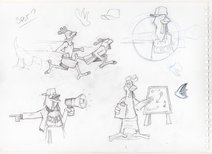 Some extra working through ideas. The football coach style blackboard felt right to add to the instructional element which would combine well with the megaphone. Above are the final line drawings for both illustrations. Below are the final illustrations which i colored using a combination of pencil and brush tools in Sketchbook Pro using my Wacom Intuos Pen Tablet. Digital drawing with these tools means that it feels like a continuation of the natural drawing process.
Aquent are a global leader focused solely on creative, digital and marketing talent helping companies adapt to change and find new ways to stay competitive. They offer a broad range of services to their clients including temporary and contract-to-hire staffing, employer of record, studios and web application development.
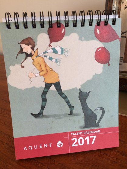
Vitamin T is the talent agency for digital creatives. They partner with clients and talent and take the time to make sure they connect people who can help one another. They provide ad agencies and mid sized companies with the best digital creatives on the planet across the Australian, UK and American markets. Every year Aquent / Vitamin T release a talent Calendar which is delivered to the desks of their clients worldwide. I'm incredibly proud to be associated with this years and to have my artwork chosen for the cover of the 2017 calendar. Competition is always tough for this and I'm delighted to join some fantastic artists included from around the world. Following on from my initial attempts with these new Derwent graphic set this is a walk through of my process creating a sketch of this beautiful statue. I’d love to have been organised enough to make notes of what grade of graphite I used for each stage of this drawing. I’m not organised. Actually, that’s probably a good thing as I’m sure we all have different ways of working and I’m sure we all have a process of trial and error with each grade and how it can work best for us. The first thing I did for this drawing was to sketch out a rough outline. I needed to make sure my scale and perspective looking upwards all worked right. The lightest grades (primarily H) worked best for the lightest of marks for this stage. Working around grades HB, B and 2B I started to add the detail of the figure. With a strong light source coming in from the left the object was thrown into real contrast. It took a few mistakes and redrawing certain areas to get the detail right. Learning to use the right pencil rather than increasing the pressure meant that I could easily erase and redraw as needed. When I was happy with the composition it was time to start working on the detail. The lack of light higher on the cathedral wall here meant that this was the area that would dictate the tones for the rest of the picture. So I decided I would simply start at the top and work my way down, pulling the statue into the drawing as I went. The grades around 5, 6 and 7B all did their job on the darkest areas with the lower B’s all helping with the slightly lighter elements of the brickwork. Another additional benefit of having such a range of grades to work with and not having to gauge into the paper meant that using a putty eraser was so much easier to lift little areas of graphite. Being able to alternate between the lightest and darkest grades of graphite as the statue started to build really helped with the process. Such was my enjoyment of this process that this piece was finished in one sitting. See the finished version here. I’m sure I didn’t use every single pencil on offer this time but with such a choice I’m sure they’ll all play their part in future drawings. These pencils have made me fall in love with drawing all over again and I know that they’ll get plenty of use. I’m looking forward to not just producing more sketches but learning more about how each grade can be used.
I'm pleased with the outcomes so far and have been hugely inspired by the quality of work that other artists have achieved with this set. More details can be found on the Derwent blog here. http:// www.lovepencils.co.uk |
Archives
July 2020
Categories
All
|



 RSS Feed
